Thursday 30 January 2014

Pledge Music // Design Sprint // DAY 3 - Development

The focus of our third day was resolving conflicts in aspects where we had more than one solution. To recap on the previous day, we stuck post-it-notes making the different ideas we had on the wall. Wherever there was more than one solution, we noted it as a conflict.

We sat down and worked through these conflicts one by one, weighing up the strengths and weaknesses of each in order to resolve them by refining these aspects and ultimately compromising to create a consistent experience for the user.

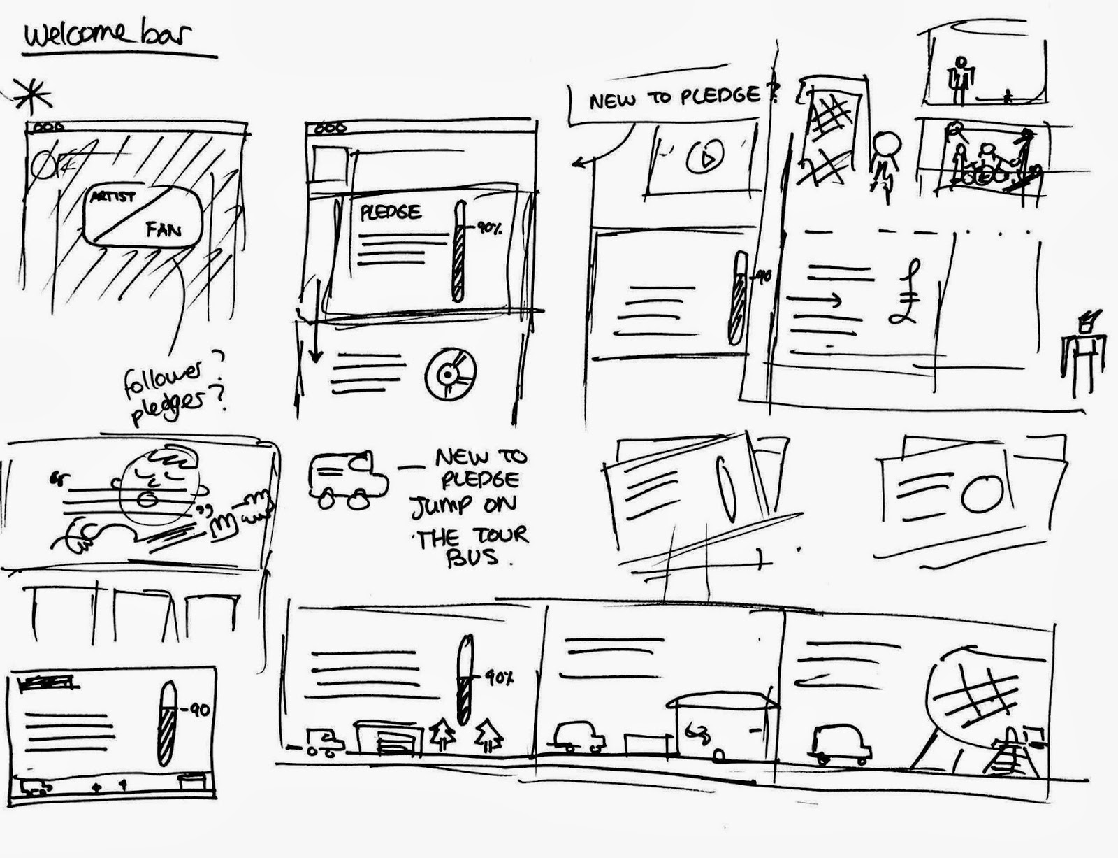
Pledge Dashobard - This would be a user area. We decided after talking through the inclusion of a user profile, that it was unnecessary and that this page could be stripped back to just contain all the information you need to keep track of your pledges. All updates from the artists would be displayed in a continuous stream.

Pledge cards and progress bar - How should we display the projects on the main pages? Our solution combined a few earlier ideas about contrasting edge-to-edge images with boxed text to create a visually interesting 'card' for each project. We decided to make the progress bar as wide as possible to really stress its importance. We also liked the idea of a consistent pledge button that would be found all over the site and act as a call to action for users. 


We carried this format through to the rewards. To distinguish, we want to use circular prices on each card. Colour would be used to draw attention to certain choices. We had a conflict over how to display images of the rewards. An elegant solution was to allow the middle box to flip to different panels which would contain content such as photographs and videos. 


Tags - One of the ways we had discussed to make the discovery of Pledge projects easier would be the introduction of tags to categorise. This would allow users to quickly filter projects in a way that could convert one pledge into additional pledges. 

Nav bar - We decided to remove the artist/ fan options from the nav bar and instead relace it with a 'new to pledge?' option. We would also need 'Browse Projects', 'About', the search bar and the username if logged in. 


New to Pledge? This would be a tour for new users that would provide a brief introduction to using the site. We wanted to  move forward with the idea of making the tour a journey in itself, showing an illustrated scene which would start with a person standing alone and end with their band playing a concert. This should inject some excitement into what can be a dull part of the site. 


Wednesday 29 January 2014

Philosophy // Final Video - Interplay of Opposites Update

For the winter hand-in, we were not able to complete the 'interplay of opposites' video in time and so we decided to revisit the animation to add in extra details.


This is the new version of the video which includes the more illustrative key words which we had decided on including. I think that these made a big difference to the visual storytelling of this script and made the animation feel warmer.  I also edited the sound slightly to make the voice louder in the mix as it was getting slightly drowned out by the music.

Pledge Music // Design Sprint // DAY 2 - Rapid Idea Generation

Building upon the topic we investigated yesterday, we started the day by constructing user profiles - allowing us to chart the journey that different types of users would go through. Doing this gave us core areas to start to improve upon. 


Dividing the website elements into sections, we identified the following initial list of areas to generate ideas for:

Landing description
Home page layouts
Logo
Project Boxes
Pledge project page layout
Sidebar
Iconography
Updates - integration
Additional Features

The technique we chose to use for rapid idea generation is known as 'crazy eights'. This involves folding a sheet of paper into 8 panels and aiming to fill each with a different idea within the 5 minute time limit. This rush against the clock allowed us to not be too precious about our ideas and to put everything in our heads onto paper.

After the 5 minute rounds, we compared our designs and discussed any overlap, similarities and differences and how we might be able to implement them into the final design.

Rounds:


Project Boxes - We liked the idea of varying the width of the boxes to draw attention to certain projects. A totaliser should also be integrated into the box in a stronger way than it currently is.


Updates Integration - We looked at ways to improve the process for seeing updates from the bands on their project pages. We liked the idea of using a 'Journey bar' which would provide a timeline of updates from the bar which could be scrolled through horizontally or jumped to by clicking specific parts of the timeline. 


Sidebar - We wanted to move away from the kickstarter-style list of rewards for pledgers. We explored a range of different options for displaying the different reward tiers. The idea of using a card view, which would put the rewards into a larger grid format, with space for full descriptions and images. Reward tiers can emphasised using colour or surrounding graphics eg. the christmas presents.  


Home Page - At this stage we started to get a much clearer idea of how the elements on the page would all come together, integrating the project 'cards' with large images and quotes that inspire users. The top bar would pin as you scroll down, giving you a constant navigation anchor that doesn't currently exist. 


Welcome Bar - We felt that the site was particularly ineffective at drawing in new users and explaining its function clearly. We wanted this process to create a sense of excitement for the user. We liked the idea of presenting the different stages as parts of a band's progress, something that would immediately give a flavour of the importance of pledge to the bands. 


Nescafe Azera YCN // Development

At this stage, we needed to focus on the specifics of the product and home down the exact requirements of the brief. We focused on the 1st portion of the brief which was all about creating a product innovation within the instant coffee market:

1. Product innovation
Our system for dispensing coffee from its packaging using a twisting mechanism fits this request really well, as it presents significant advantages over traditional packaging:
-Dispenses the perfect amount of coffee
-Removes the need for a spoon
-evokes the sensation of grinding beans, which we associate with better coffee. 
-Reduced, and refillable packaging

This already placed limitations on the shape of the packaging, as to do this most efficiently you would need a hollow cylindrical shape in two parts, as there would need to be some kind of mechanism for twisting. 


Focusing on taking this idea forward and making it a feasable alteration to packaging, I worked at figuring out a design for the mechanism that would dispense the same amount of coffee for every twist of the box. 


We settled on this solution, which used gravity to keep filling one chamber with coffee and another is emptied. This simple approach would just use selective cuts in layers of the packaging and would be much much cheaper than using mechanical parts or gears. I made an exploded diagram for our boards demonstrating this construction:


While I was working on this, Sam was looking at the design of the packaging, as the appearance is just as important to consumers as the functionality. We arrived at the idea of having half the packaging coloured and the other half as brown recycled stock. This would feed into the concept of twisting. He explored a few variations of this concept:


We finally settled on a diagonal colouring - a much better visualisation of 'instant coffee' with a twist:


The bottom section would lift out and present an upside-down refill sign, reminding them to turn the packaging over. 

From here, we explored a lot of extra details, such as indicators that would mark how far the packaging needs to be twisted. One thing we thought would be vital for this brief is shelf presence, as a lot of instant coffee products look the same. Our solution for this was to vary the direction that the boxes face to create patterns of colour. We expanded this concept to the lids as well. so that more intricate patterns could be create by stacking the boxes on their side. 


sideways stacking patterns

alternate patterns from upright packaging. 

This solution helps us meet section 2 of the brief - creating instore promotion, and does it in a way which can be easily implemented without additional cost by just varying the arrangement of the boxes. These patterns will also change naturally as they are lifted from the shelves by customers. 


Tuesday 28 January 2014

PledgeMusic // Analysis of rival services

 Kickstarter:
The largest crowdfunding site, popular to extent that the term kickstarter is synonymous with crowdfunding. It lacks the specific focus of Pledge, allowing broad categories of campaigns to be posted. Unlike Pledge, there is no human involvement in the campaign and it runs autonomously. In terms of design, the Kickstarter interface is lightyears ahead in both functionality and UI. It is a pleasure to use and hides complicated infrastructure behind a simple interface. The colour choice and flat graphic style is modern and fresh, and the site is truly responsive as well as having its own phone app. Most notably is how much better kickstarter is at explaining itself to new users and drawing them in. This is something which Pledge could be doing much better.


Twitter Music:

A new service that calculates the artists who are most talked about on twitter and presents them in a striking interface which allows clips of their music to be played. The interface is so stripped back that the album artwork is allowed to shine. The dark aesthetic makes it stand distinct from regular twitter and lazy loading ensures that it always loads quickly and never overwhelms the user with choice. 


Indiegogo

Indiegogo is another hugely popular crowdfunding site, having founded the term DIWO (Do it with others). They are unique in their 'flexible funding' option, which doesn't require the campaign to reach its full target for money to be taken. Indiegogo provides a strong alternative to kickstarter in its own right and again uses a simple, fresh interface to simplify the process and spark a sense of excitement and inspiration around the format. 


Nescafe Azera // Initial ideas and product innovations

In seeking out a new packaging/distribution format that could disrupt the instant coffee market, we looked at existing alternative packaging and clever designs within the coffee market.


This solution uses packaging as the delivery method, allowing you to pour boiling water directly into the bag to make coffee. While impressive, we found that the pack cannot be refilled and so does little to help make coffee packaging more environmentally friendly. 


This collectable mug from starbucks caught our eye, as when it is reversed it looks like the mug is full. This kind of product celebrates coffee culture and rewards brand loyalty. 


We explored a number of ideas at this stage, focusing on the keywords of the brief to seek solutions that either sped up the time it takes to pour coffee, or provides a novel solution that stands out against competition. We looked at both methods in our brainstorm. Some wacky ideas came out at this stage but it was helpful to get our minds working on a viable solution.

Some early ideas included:
- a funnel that pours multiple cups of coffee simultaneously e.g. in an office environment.
- A plastic spoon with coffee in that you mix into boiling water
- A coaster with coffee in that you use and then put your drink on
- A sort of pepper grinder for coffee


Pledge Music // Design Sprint // DAY 1 - Investigation

DAY 1 - Investigation

Today we wanted to gain as broad a knowledge around Pledge as we could. To do this, we conducted a series of 10 minute sprints to investigate the following initial topics:

1.Competitors (Design)
2. Competitors (Function)
3. Pledge's Vision
4. Experimental Websites
5. Usability and User interface
6. Pledge Website (Content)
7. Pledge Music Structure

After some initial discussion, we trimmed this list down to:

1. Competitors - Who are they?
2. Pledge's Vision
3. Experimental Web Design
4. Usability in Web
5. Problems with pledge
6. Crowdfunding competitors - How do they communicate their ideas


1. Competitors - Who are they?

Kickstarter

Broader focus, allows different projects e.g. art, comics and design.
Most popular corwdfund site

Everything must be a project with a clear end.

Songkick Detour (For live music events)
Sell gig tickets - If enough are sold the event goes ahead.

Crowdhoster
Pledgup
Crowdfunder.co.uk
Small Knot (Focus on projects in your community)
(Uses a sash to indicate successful project)

2. Pledge's Vision
The way Pledge describes itself on the website:

The most creative and exciting way to get your music to your fans
A team that will guide you through the process.
You invest in the future of music
If you don't see your favorite artist on pledge, contact them
Invite your fans into your journey
Each project is personally assessed by a team member.
Partnerships with major players
iTunes for the superfan

Wiki:

Encourages Charity
Deosn't retain any rights
Absorbs all processing costs
Wide range of exclusive content
Doesn't change

Interviews:
Online direct-to-fan music platform
Facilitates musicians reaching out to their fanbase to pre-sell, market and distribute music projects including recordings, music videos and concerts.

Spinal Tap - "You can't promote something that doesn't exist."... Well now you can.

3. Experimental Web Design

Qualities:
Totaliser to show progress
Reward for milestone backer
Different size content boxes
Large Background image
Moving images on top
Large carousel
Animation on scroll
gif as rollover image

4. Usability in Web

Netflix categories -> don't have to know what you want
Mixlr iconography
Tooltips to give info to content boxes.
Intro video/ animation
Tag colours
different types of music
Stream - recommendations
What are my friends pledging
People who backed this also backed this.
Home page portion of full site

5. Problems with pledge
Ugly colours
Gradients
Bad type
Should use full bleed images and boxes that reach the edges
Too crowded
Not clear enough
Scroll glitch
Not a lot of projects on the front page
Social brand inconsistancy
Too much copy on many pages - could be simplified
Profile pages could be simplified
Tiny bottom nav
High q photos needed
Press should be in contact page
More images
Removal of dated trends
boxed in
mobile site could be simpler
Needs categorisation

6. Crowdfunding competitors - How do they communicate their ideas

Crowdfunder.co.uk
"Connect projects to communities"
About
Video - success stories
Explanation
Add your project - one easy button

Kickstarter:
What is it - first nav option
Seven bullet point explanation
Quotes from people who like the site
Large images

Indiegogo:
The world's funding platform.
Fund what matters to you
4 main points:
-Raise money
-Campaign
-Global exposure
-Get inspired

Songkick Detour:
Bring bands to _____
Here's how it works:
1. Pledge
2. Guarantee
3. Get tickets

Last.fm:
Use of tags
Similar artists
We think you'd like...

Twitter Music:
Full images
big images of happy people

Nescafe Azera YCN // Visual research, Packaging examples

We wanted to reposition Nescafe as a luxurious but accessible brand for young coffee drinkers. To do this, we looked at examples of alternative food packaging for aspects that could feed into our design choices. 


We loved the way that colour can be used to demonstrate range and create striking imagery when stacked. 


Using alternative shapes such as this triangle construction can catch consumer attention, in this example I particularly liked how the white label contrasts agains the colour background. 


We were both drawn to examples of food packaging using brown/recycled stock and felt that it made the product look fresher and more authentic.  


We liked the colour scheme used here as it is strong and autumnal, and utilises a similar orange and blue from the current azera range and contrasts them with fresher pastels. 


This example of reduced packaging is so simple that it makes the product seem fresher and more wholesome. This are the kind of qualities we would like to convey through our packaging.


Pledge Music // Design Sprint

Background:
Pledge music is a company that facilitates crowd funding for musicians to allow them to finance the recording and production of their music. This allows users to be part of the creation of the album. In exchange for pledging money to the artist, they receive constant updates throughout the campaign and an eventual reward which is dependant on the amount pledged. This aims to involve fans more transparently in the ‘music industry’, altering the fan-musician relationship in a way that hopes to bring them closer together for mutual benefit. 

Concise Brief:
Help pledge to realise its full potential by updating its design and usability, allowing it to compete more effectively in the digital market. 

Brief:
Use design to help Pledge Music become a thriving modern solution to the necessity of record labels within the music industry. its full potential is to allow musicians to independently release music, funded instead by their own fans.To do this we need to vastly improve its design and usability, allowing it to compete more effectively in this market. Competitors in the field, such as kickstarter, are much more design orientated, and this could be a barrier for potential new users. Clarity is key, and pledge could be doing more to better communicate its model to both artists and fans. 

Concept:
Create a user-friendly interface for pledge that uses simple, clear design. There should be a particular focus on mobile users and the ways that pledge can communicate their model clearly to users. 

Tone of Voice:
Clear
Friendly
Welcoming

Influences:
Kickstarter
Mixlr
Mixcloud
Twitter Music
Hype Machine
Soundcloud


For this project, we will be using an adaptation of the Google Design Sprint, which is used by the company to find solutions to product design challenges. This format has been altered to better suit graphic design. I used this methodology successfully earlier in the year and liked how efficient it was at creating comprehensive, considered and fast solutions to a design brief. 


Starting on Tuesday, we will conduct thorough investigation into the function and context of the Pledge Music service. The aim of this stage is to gather as broad a base of knowledge as we can in order to best understand the design problem. 

On Wednesday we will rapidly generate ideas, producing as many solutions to these identified specific design problems as we can. Using a range of sprint exercises on paper, we will be able to choose from the selection of solutions and even combine ideas to produce results we are happy to develop further.

On Thursday we will concentrate on fleshing out the agreed concepts and making them the most considered solutions, matching our user stories. At the end of the day, we will have to decide whether to bring two competing ideas forward to mock-up stage or to concentrate efforts on just one. 

On Friday we will produce a rough prototype which can be tested after the weekend. This would present the discussed concepts in a visual way that would indicate how the final product would look without being too precious about the details. 

The following week will start with a crit of the prototype, aiming to collect as much actionable feedback as we can. The rest of the week will be a less structured developement of the product from a rough draft to a polished final solution. 

Monday 27 January 2014

Nescafe Azera YCN // Brief Clarification and Research

This is a collaborative brief with Sam Hoh

After working successfully with Sam in 2nd year on our D&AD entry, we both wanted to enter a competition together in 3rd year as well. Sam is very good at design strategy and is able to work conceptually with an awareness of audience, context and environment. He is also strong at Design fundamentals and layout, which compliments my image skills and technical knowledge really well. From this year's set of briefs, we were both keen to enter YCN.

In choosing a competition brief, we looked at 3 candidates:

Confused - Campaign to get young people to buy insurance through confused. 

Nescafe Azera - Market high-quality instant home coffee through a new product innovation or tweak

Morrisons - Rethink the complete shopping experience


Some initial discussion made us eliminate the Confused brief and so we decided to brainstorm some starting points for each of the other two, breaking apart the brief and sharing initial thoughts 


Of the two sets of initial ideas, we found that we felt that we could provide a unusual solution for Nescafe and decided that focussing on this would allow us to concentrate our efforts and go back to the start to research more thoroughly.

We studied the brief again carefully:

-----------------------------------
Brief:

Background:

Millions of coffee lovers are becoming baristas in their own homes following the introduction of NESCAFÉ AZERA, a new way to look at instant coffee. Through combining a tasteful blend of instant coffee and finely ground, roast coffee beans, we are able to deliver a true barista style beverage, with all the aroma, taste and look of a coffee-shop coffee.

Brief:

1.Come up with a new product innovation for NESCAFÉ AZERA. It can be a tweak to a revolution, for example - a new packaging idea, a new way to drink coffee, or even a simple design tweak. Think about creative solutions for ensuring our consumers are able to access the highest quality coffee in an instant. Remember, this doesn’t have to be a revolution; small changes can be just as impactful. The important thing will be how you bring it to life.

2.Create a social media campaign to launch your new product innovation. Any social media is fine by us. Please explain the campaign and bring it to life with visual examples.

3. A big part of a new launch is making it stand out instore. Show us how you would make your new product innovation catch the attention of audience while they shop. Use any form of media you feel would work (traditional instore displays, mobile, digital, branded merchandise).

Audience:

Our audience is a young and dynamic consumer. The AZERA buyer is 25-35, and part of ‘generation possible’. Not satisfied with accepting they can’t have something, they will find a way to make it happen. They challenge conventional ideas to get a better outcome. They have changed the rules in so many areas – from starting businesses with Kickstarter and Etsy, to redefining fine dining with street food and gourmet burgers.

Requirements:

All work must include the full brand logo
The logo cannot be changed, please always use it as given
Fonts: Barista Style Instant Coffee = Trade Gothic LT Pro Bold Condensed No. 20, Product descriptor text = Serifa Std. If you don’t have these please use something similar.

Concept:


We aimed to provide a truly new way to enjoy instant coffee, creating a product innovation that would engage the consumer and provide a fresh experience that challenges conventional coffee delivery methods. 

-------------------------------------


Using rounds of 10-minute design sprints, we were able to find out as much about the instant coffee market as we could:


Some really interesting research came up in the sprint, and it was great to see that me and Sam had taken different avenues of research and were able to discuss and compare aspects we found interesting or relevant. Much of both of our research pointed to trends showing that the UK is becoming more European in its approach to coffee and that the instant market is still growing and trying to find its feet in the emerging coffee shop culture. 


Using additional sprint rounds we looked at investigating the audience of coffee drinkers specified in the brief, coffee shop brands and home coffee brands and products, and how both are able to merchandise their products for advertising and customer engagement purposes. 


Wednesday 22 January 2014

300 seconds // Research into accessibility and colour

After sending our initial design for feedback, we were asked to make a number of changes:

- Firstly the client was worried that, as the brand is primarily web and screen-based, that the colours were not dark enough to meet accessibility colour contrast standards.

-They didn’t like the purple option, so we needed to look for a new swatch colour. 

- They also felt that our solution for including the place in the logo felt very disconnected and not connected to the rest of the logo. 

 Dealing with the first piece of feedback was eye-opening for me, as I had never taken the accessibility of my design choices into consideration. In order to solve this problem and meet the requirements of the brief we had to both research into standards of accessibility on the web. Through my research I quickly learned how important these considerations are and techniques to make your design functional for as wide an audience as possible.

We were asked by the client to make the colour contrast between the logo colour and white background meet WCAG AA accessibility standards. 

In researching this, I found that Web Content Accessibility Guidelines (WCAG) provide guidelines for web designers which act as defacto standards for making the internet accessible.  The thing that suprised me most in this initial research was just how many people are affected when the deisgner has failed to consider usibility and accessibility. From the WCAG site:

"Web Content Accessibility Guidelines (WCAG) 2.0 covers a wide range of recommendations for making Web content more accessible. Following these guidelines will make content accessible to a wider range of people with disabilities, including blindness and low vision, deafness and hearing loss, learning disabilities, cognitive limitations, limited movement, speech disabilities, photosensitivity and combinations of these. Following these guidelines will also often make your Web content more usable to users in general."

By following these guidelines, you are not just making your design accessible to people with visual impairments, it actually makes your web design more functional for everyone. For example, using a phone in the sun creates low-contrast conditions, a problem which can be reduced through implementation of proper colour contrast values. 


Design Studio UsTwo provide a handy extensive PDF called ‘Pixel Perfect Precission’ which was great research for this project, introducing us to methods of design to improve usability for as wide a range of users as possible. This is the single best document I have ever read on graphic design, providing practical advice and knowledge which is extremely helpful to any designer but which I have never seen in a design book. I will be evaluating this PDF in full on my PPP blog. 

Through this stage of research we were able to redesign the logo set with WCAG AA complient colours to meet the client’s expectations.

Colour Contrast:


This was our primary concern for this brief, as the client asked for a minimum level of WCAG AA compliance. Through the Pixel Perfect Precision document, we found an online colour contrast checker which we used to check each of our swatch colours and adjust them until they struck a balance between  finding colours that are high contrast to white and also not too dull. This is something of an art because, as a general rule, the further you move a colour away from white, the duller and more brown it gets. We had to tweak and tweak until we found tones that looked consistant as a set and didn't disrupt the importance of colour to the brand. 


Here was our final colours, which met the minimum standard requirements:


Tuesday 21 January 2014

300 Seconds // Development

Based on the feedback we set to work trying to find a way to make the location tag more included in the logo. We found this to be a challenging task as we wanted to retain the core elements of the existing brand, to retain consistency and brand recognition from past events. However we knew that that the only way to do this would be to alter the shape of the original logo so the bar was attached to it or sat under it. We noted that one of the key problems with our previous solution was that it was too long and horizontal, when a good identity for the web should be rectangular/square to fit avatars, profiles and fit well on mobile devices. 


After settling on having the location bar sit directly below the ticket we explored ways of including the stem of the speech bubble in some way without creating too much visual clutter. 


Our final solution was to remove this element entirely, and instead use negative space on the location bear to imply the presence of the speech icon. This created a much more visually interesting logo, and met our goal of creating something which looked like an evolution of the core brand, not a revolution. 


We were both much happier with this solution, and were glad to have gone through the process of responding to client feedback, as it definitely made us give more consideration to the design and produce a much more effective and future-proof outcome. 


Wednesday 15 January 2014

300 Seconds // Development

We started the brief by discussing the qualities of the logo that we definitely didn't want to change. These were the ticket stub and speech bubble triangle as these both tied into the event theme quite well. To answer the brief, we needed to firstly find a way of tastefully including additional text in the logo, and make this solution flexible enough that it would work for future use cases e.g. sponsor names or long placenames.


We looked at a few different initial solutions, trying to utilise elements from the original logo and expand on them as to not radically alter the style of the existing events. We tried using additional speech bubbles, ticket boxes and even the stopwatch form the logo but found that none of our initial solutions really worked that well as a complementary element. 

From here we developed the idea of stripping away the unnecessary ornamentation and using tangled slant of the logo to imply association. We found that this subtler approach immediately looked more visually consistant. 


This is the final format we decided to move forward with. The city/place name fits in a parallel bar to the right to keep everything consistent. The next part of the brief was to introduce a range of colour options for event partners to choose from, and to replace the pink colour to remove the feminine associations from the brand. 


We transitioned the pink to more of an orange-red which kept the vibrancy of the original colour option, we also introduced 3 additional variations: Green, blue and purple. These were sent back to the client for feedback. 


We also indicated how this design could be applied for commercial sponsors or brands:


Thinking of possible use-cases for the logo, we also created an animated ident in AfterEffects to be shown at the start of the talks videos which are uploaded to youtube. This would help to increase the professionalism of the brand through this platform. 


Lastly, we made an acrylic sign to be used at the event, by cutting the logo from vinyl and applying this to clear acrylic sheet.