
We wanted to reposition Nescafe as a luxurious but accessible brand for young coffee drinkers. To do this, we looked at examples of alternative food packaging for aspects that could feed into our design choices.

We loved the way that colour can be used to demonstrate range and create striking imagery when stacked.

Using alternative shapes such as this triangle construction can catch consumer attention, in this example I particularly liked how the white label contrasts agains the colour background.

We were both drawn to examples of food packaging using brown/recycled stock and felt that it made the product look fresher and more authentic.


We liked the colour scheme used here as it is strong and autumnal, and utilises a similar orange and blue from the current azera range and contrasts them with fresher pastels.
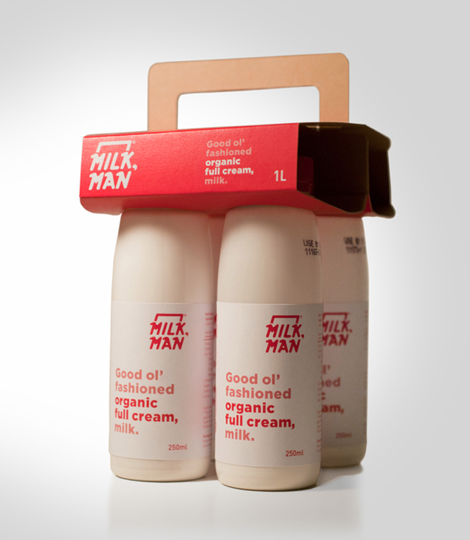
This example of reduced packaging is so simple that it makes the product seem fresher and more wholesome. This are the kind of qualities we would like to convey through our packaging.
No comments:
Post a Comment