
Building upon the topic we investigated yesterday, we started the day by constructing user profiles - allowing us to chart the journey that different types of users would go through. Doing this gave us core areas to start to improve upon.

Dividing the website elements into sections, we identified the following initial list of areas to generate ideas for:
Landing description
Home page layouts
Logo
Project Boxes
Pledge project page layout
Sidebar
Iconography
Updates - integration
Additional Features
The technique we chose to use for rapid idea generation is known as 'crazy eights'. This involves folding a sheet of paper into 8 panels and aiming to fill each with a different idea within the 5 minute time limit. This rush against the clock allowed us to not be too precious about our ideas and to put everything in our heads onto paper.
After the 5 minute rounds, we compared our designs and discussed any overlap, similarities and differences and how we might be able to implement them into the final design.
Rounds:
.jpg)
Updates Integration - We looked at ways to improve the process for seeing updates from the bands on their project pages. We liked the idea of using a 'Journey bar' which would provide a timeline of updates from the bar which could be scrolled through horizontally or jumped to by clicking specific parts of the timeline.

.jpg)
Sidebar - We wanted to move away from the kickstarter-style list of rewards for pledgers. We explored a range of different options for displaying the different reward tiers. The idea of using a card view, which would put the rewards into a larger grid format, with space for full descriptions and images. Reward tiers can emphasised using colour or surrounding graphics eg. the christmas presents.

Home Page - At this stage we started to get a much clearer idea of how the elements on the page would all come together, integrating the project 'cards' with large images and quotes that inspire users. The top bar would pin as you scroll down, giving you a constant navigation anchor that doesn't currently exist.
.jpg)
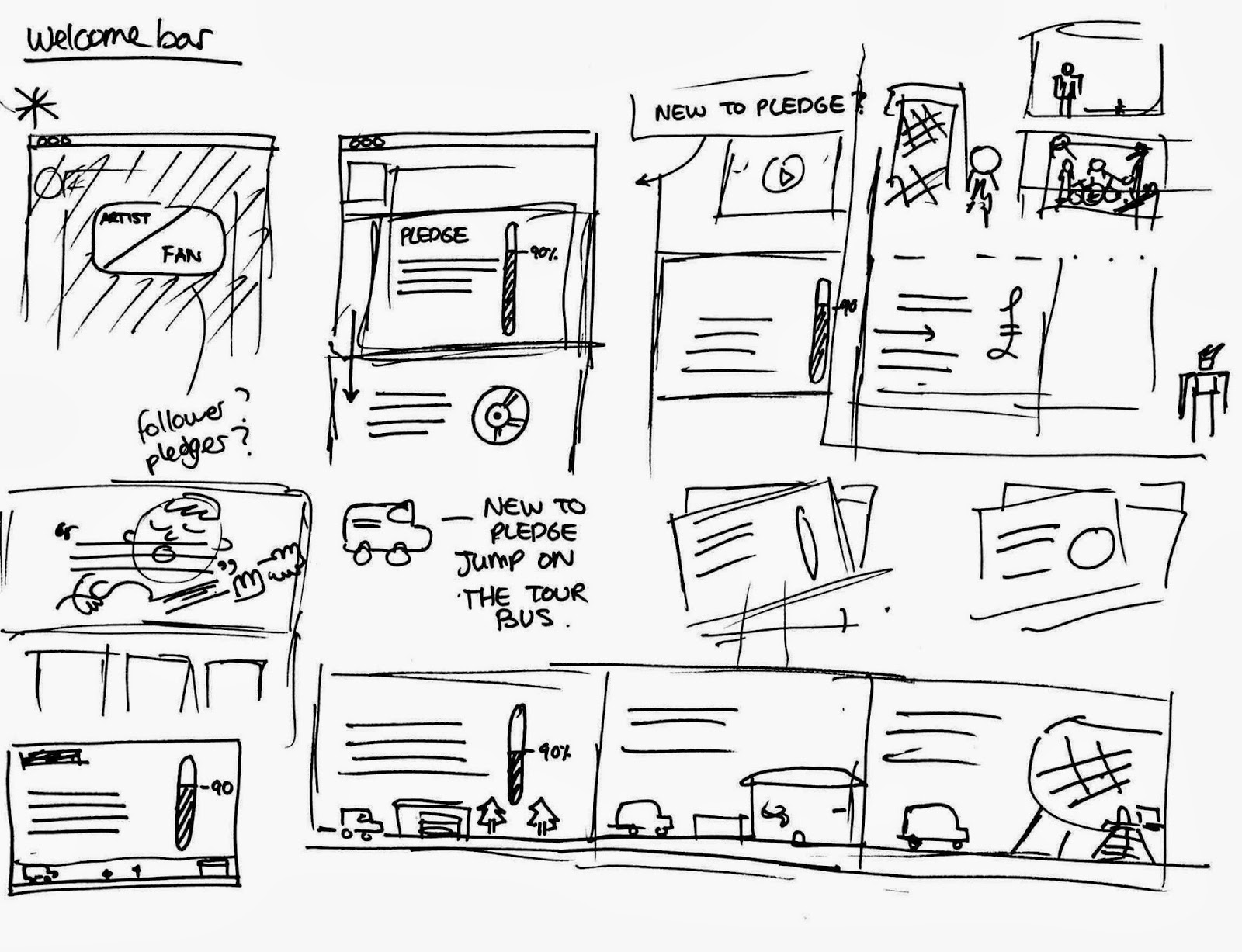
Welcome Bar - We felt that the site was particularly ineffective at drawing in new users and explaining its function clearly. We wanted this process to create a sense of excitement for the user. We liked the idea of presenting the different stages as parts of a band's progress, something that would immediately give a flavour of the importance of pledge to the bands.
No comments:
Post a Comment