Monday 16 December 2013

Hungry Sandwich Club // Website placeholder

We bought the domain hungrysandwich.es for our future site. For now we have used a placeholder which uses the logo with some javascript to make the background switch between our chosen swatch colours every 2 seconds. The site currently links to our twitter, vimeo and email accounts which all use a different colour variant for our logo. this helps to reinforce the importance of colour to our brand.


Wednesday 11 December 2013

Newspaper // Final Boards

Elmwood // Final Evaluation

This live brief set by Elmwood was quick-turnaround brief for me. The brief was simple in theory but required you to think about the whole process of defining a service through branding, considering the needs of customers and explore how branding can be used effectively to give character to even the most boring of jobs.


Branding hasn’t been a big focus in my work so far this year and so it was refreshing to take on a task that challenged me to exercise core Design skills within a limited timeframe. I felt that it was especially valuable to get feedback on the brief from external professionals as this something we have not experienced much of at this stage of the year and I received direct and formative feedback from Elmwood that helped to shape the project into abetter final brief. I regret that this brief came at a busy time of the year for me and as a result I wasn’t able to give as much time to to my solution as I would have liked. I would have liked the opportunity to expand the range of the brief and create more solutions that indicated tone of voice, effective copy and style that would have transformed this from a short brief to an expanded project. Despite this I enjoyed taking on the design challenge presented in this brief and hope to exercise the same skills more fully in further branding projects this year.

Brudenell 100 // Final Evaluation

This has been the most experimental digital project I have attempted so far and while the end result wasn’t at the level I wanted it to be to make it in time for the 100 year celebrations in November, I have learned so much in the process.

I was able, in a short time frame, to learn to create and code fully HTML 5 animations without using images, utilise javascript frameworks to enhance the user experience in my designs and gain a better understang of what is and will be possible on the web as these technologies evolve in the next few years. None of these I had experience in before the start of this project. I attempted something super ambitious and in doing so underestimated the amount of time it would take to learn, implement and tweak it and missed the deadline for it to be relevant as the anniversary has  now passed.

I wasn’t able to find a way to scale the animations for different screen sizes, so the site breaks if not seen on a laptop. I would also need to implement a mobile site if this were to be shared online. Now that the anniversary has passed, it is too late to make these changes and see it live which is dissapointing, but I don’t regret taking on the brief at all.

Indie Game // Final Evaluation

This has been a really valuable collaborative brief for me as I was able to thoroughly research a medium and way of working that I was unfamiliar with, and in 4 weeks produce a sizable body of work and viable proposal for a video game. I feel that this is the strongest digital project I have completed on the course so far and definitely the project with the most contextual awareness and real-world viability. 

The animation, style guide and research booklets demonstrate the amount of work that goes into designing all the different elements of a video game. Producing the research booklet was a very useful activity for me, as it ensured that we had both considered the different aspects involved in the brief and understood their contemporary and historical contexts. Having one document to refer to  for this was especially helpful in the design stage of the project, so is something that I would like to carry on in future briefs. By laying the style guide out in a simple way, we allowed the design to speak for itself and it was a great way of capturing all of the separate pieces of design that went into the project in one place. I felt that the animation turned out to be really effective way of communicating all of the separate design elements in a way that wouldn't be as easy to communicate through print. By controlling every aspect from the sound to the storyboarding and design, we could ensure that the outcome provided a true solution to the brief.

This was the first project of third year, and I felt that as neither of us were working on other briefs and we were both really strict in planning our time, we could maximise the amount of work completed in a day. Making use of dropbox, we were able to be sure that we were both working with the most up to date files and could split tasks on the same design element without affecting the other’s work.

Newspaper // Final Evaluation

I am really pleased with how this project came together. The design sprint proved to be a great way of working collaboratively, as it allowed us to structure the week definitively and see real developments every day. At every stage it seemed to speed up the amount of work we were able to complete. In the research stages it was able to give us a broad understanding of context, audience, format and content. In development it let us rapidly develop an idea to prototype stage in only a few days. I would definitely incorporate sprinting into future projects and would recommend it as a working methodology to anyone. This has been my favourite print project on the course so far. In our second week we were able to respond to crit feedback on our prototype to produce a format and brand that could become a viable newspaper if original content could be sourced. 

Tuesday 10 December 2013

TBM Flag // Evaluation

I found creating a reimagined UK flag to be a much more challenging brief than I had initially expected. Flags have so much meaning and heritage that cannot be changed from their traditional formats, standards and colours that it becomes a really hard design challenge which produced both some really unusual solutions and some plain variations. The short deadline of the interim crit and submission hand-in made this even harder, and neither of us were particularly happy with the outcomes we had developed in the time-frame. I did however find it a really interesting challenge that required a lot of research and got me to consider audience and heritage in a completely different way to most briefs. For attempting this brief as a project, I think that if Scotland left the UK the flag would remain the same as patriotism, flags and icons mean so much and so many different things to different people that any new solution would meet huge criticism. It was interesting to see how many different solutions had been created in the classfor this, and I fee that I have learnt just as much during this brief from other people's projects that were informed by different research and angles than I did from my own.

Brudenell 100 // Site

These are the 6 panels that the user is able to switch between. The copy switches dynamically through javascript depending on which button has been pressed. 


Monday 9 December 2013

Elmwood // Contextualisation Submission Boards

One of the big pieces of advice from the interim crit was to contextualise the brand, and indicate the types of practical outcomes that would be required as part of branding the business. I initially thought about the traditional role of an energy supplier, and produced an example postal bill, complete with a breakdown of the renewable energy sources that were used to generate your electricity for the bill period. This involved very simple typesetting and iconography. A big part of my pitch for the brand was the ability to change price plans every month to suit current usage. As a result the current plan is clearly stated in the top left of the bill:


As well as environmentally friendly, I wanted to make the brand consumer friendly. One way of doing this was to simplify the meter reading process and provide a more convenient way of comparing and archiving previous bills. I decided to create an app to serve both of these purposes:


On the left, the 'Your Balance' section shows the current status of you bill as well as your current price plan. The previous statements dropdown keeps a record of every bill listed on the account and indicates by colour whether it is paid or outstanding. 

On the right, a very simple text entry system allows consumers to read their own meters and submit them through the app on request, a more convenient service than doing so over the phone. 

Utilising these extra elements, I created a new set of submission boards to enter into the competition:


Sunday 8 December 2013

Brudenell 100 // Final Illustrations

These are the final illustrations I have settled on. They show (from top left): Drinks, birthday, gigs, darts and pool. 


Friday 6 December 2013

TBM Flag // Adjustments


This was the concept that was most strongly favoured in the crit, which used data on all of the counties of England, Wales and N. Ireland and converted this into proportional squares ranked in size order. We needed to take this information and make it looser and more aesthetically appealing for the flag.


We tranced a line from the bottom-most point to the topmost to make smoother triangles and rounded the corners to give a softer look. 


We played around with making the composition more angluar


Duplicating to make proportional patters


Curving these shapes like a waving flag


We also experimented with showing the landmass data in a number of different ways but found that they created patterns that didn't look at all British:

England - 20,668
Wales - 45,043
N. Ireland - 5,428


After these experiments we still weren't at all happy with the constructions and decided to strip the idea back completely to its simplest and represent the UK with 3 proportional lines. We felt that this looked a lot cleaner and friendly than the harsh triangles we had been trying to arrange, but still created a very different solution to the brief. 


Thursday 5 December 2013

Elmwood // Interim Crit Feedback

Whilst the interim crit with Elmwood was group-based, the feedback was primarily delivered by Steph from Elmwood as we pitched our boards and were given direct feedback, the rest of the group then pitched in with ideas for improvements. Here were the boards I talked through during the crit:


Steph liked the idea of the green energy supplier and using the plug motif to run through all of the brand. One suggestion was to create a visual guidelines for elements like bills and websites which connected modules using wires protruding from the logo. Another was to place the logo at the bottom of the page and uses a horizontal rule to act as a skirting board. This would give the plug a contextual positioning and reinforce the brand.

I was told that I should demonstrate practical outcomes and give an indication of how the consumer will interact with the brand e.g. through a website or paper bills and these should be included with the final submission.

This will be my focus for the remainder of the brief, I need to think of the actual context of the brand and demonstrate this in a more meaningful way. 

Crit feedback 5th December

Philosophy Animations
Were you bored?

The music adds to it
Hannah's voice is animated - really nice voice

You could add icons/stars

Make big words stand out - what is stressed in the voice?

black on white effective

Consider slowing it down, words appear fast in places.

Context - Could be shown on 'bed time' section of children's TV.

Brudenell 100 Website
Navigation boxes - same stroke width as logo
Change colour of football pitch
Can you identify the activities shown?
Improve the darts - Don't look like darts
Improve the pool - Not immediately obvious, add some reference ie. pool cue or lines
Advised to send it to the venue as soon as possible and hope it is promoted.
Make a simple mobile site and encourage people to visit the full site on the desktop.

Hungry Sandwich Club
Good balance with tone of voice - Both professional and characteristic

Wednesday 4 December 2013

Hungry Sandwich Club // Manifesto

We spend nearly a whole day really refining what our studio should represent, the kind of work we want to take on and the kind of business we want to run. This process culminated in working on a studio manifesto to codify all of these ideas into one document. This gives us a strong basis to brand from, promote ourselves and create a confident business plan.

We were careful with the wording, changing phrases like:

1. We are image-based designers - This means that we have the ability to combine graphic design and illustration to provide a complete service for you. 

to

1. We are image-based designers - Graphic Design and Illustration is our bread and butter. 


 This tone of voice is something we have spoken about at length, and something that we think will be important to the brand and the relationship we establish with our clients.

Brudenell 100 // Pool Refinement

The pool animation was a problem because it was the only one of the set that didn't loop. While I really liked the animation of the break, unless it is shown first, the user will reach it after it has already finished. Animations that repeat on a loop or reverse on a loop are proving to be way more effective for this reason. It also lets the site users revisit sections and still see the content as it was the first time they visited. 


This is the animation paths I was using for pool. As this scenario cannot looop, I had to think of a more interesting technical solution.


Having learnt this technique from experimenting with the dart board, I knew that I could have the balls follow a number of paths across the full width of the screen. This created a really effective solution that was much more visually engaging and simple. 

Screencaps of the balls passing each other. The repeated paths give the illusion of a more random travel and disguises the loop. 


Brudenell 100 // Initial Graphics

I set about making simple geometric adaptions of my sketches, creating scenarios that would animate well within the limitations of HTML5 Canvas. Here were some examples


Pool


gigroom

drinks selection 


All of my initial attempts, it was clear that I needed to really heavily refine the types of images I was creating. Firstly, they were too complex. The use of simple shapes makes the site load much faster, and would help to make the scenarios more stylistic, consistant and easier to animate. This was a limitation in the technology that I had not anticipated, but which became clear through trial and error. It was also clear that I needed a colour scheme to stick to as there is too much going on in these scenes. Stripping back the colours to something more interesting would definitely help stylise the site and bring them all together as a set. 


This was the colour scheme I chose to carry forward. 


The benefits of making these changes was clear straight away, and I carried these principles across to the whole set.


The table football was particularly complex to animate:


The darts animation was particularly useful to do as it taught me that you can animate the same object across multiple paths and it will cycle through them without redrawing it. This is a really efficient way of animating on the web as it cuts down the among of processing that has to be done at the user's end. Here the same dart drawing follows one path, then moves to the start of the second path to follow, then the third before repeating the whole cycle. This makes the use of a loop way less obvious to the viewer. 

Next Steps:
The drinks and pool animations are proving to the most troublesome and so they will need more attention to fit the set.

I need to design the website that will house these

I will need to write the copy to be displayed with each. 


Brudenell 100 // Change of Direction

After attempting to storyboard the animation, I decided realises how huge a brief it would actually be to produce an animation as slick as the examples I had been looking at. As I had only scheduled a week for it, and had fallen behind heavily in that week, I would have to work on this amongst other briefs. I needed to be realistic about time-frame, and don't really need another heavy animation project to follow my Indie Game brief.

Looking for alternative ways to celebrate Brudenell's character, I started looking at the way animation can be incorporated on the web and found that the technology to do this well has advanced massively in recent years.


One technology I had become really interested in is HTML5 Canvas. It allows shapes to be drawn and manipulated by the browser (rather than displaying a image). This gives the designer unprecedented flexibility when dealing with animation on the web without requiring the user to have a special plug in (ie. flash, quicksilver etc.) and without making sites huge to load (the user doesn't need to download any images). 

I started to research ways that I could use this myself. Following tutorial sites, it became clear that even simple shapes required a large amount of manual coding to draw, let alone animate. Once I had taught myself the basics I became ambitious and wanted to find a way to use the more complicated shapes I had created in illustrator without coding them manually. I stumbled upon an Illustrator plugin called Ai2Canvas which turned out to be the turning point in the brief I had needed, opening up a new avenue to explore for my practice by combining web and animation in a truly new and useful way.


I could see the potential really fast, producing a demo in 15 minutes using minimal javascript. 


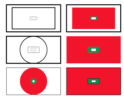
So this in Illustrator...

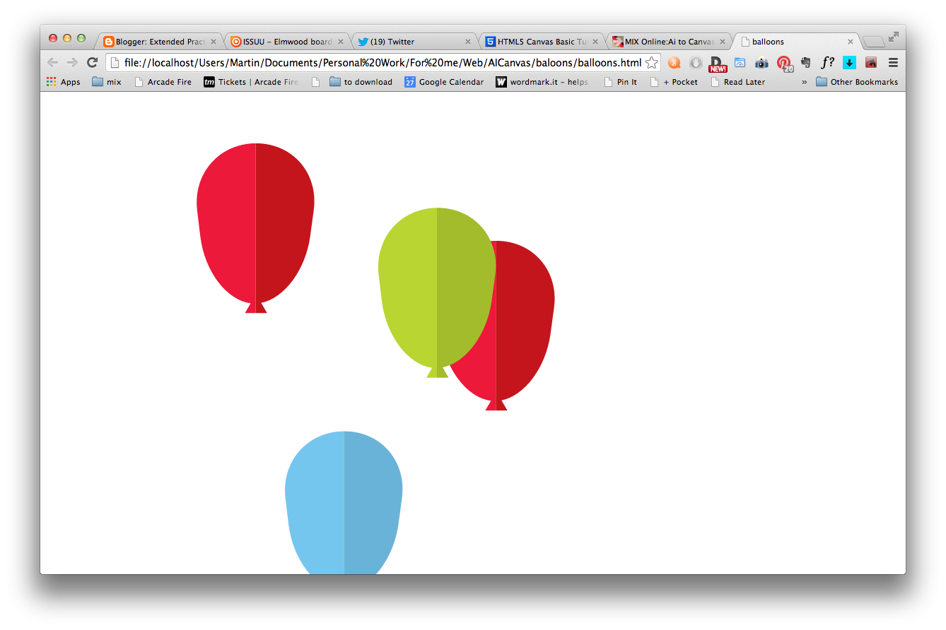
Quickly became this in the browser (moving)

 My next job was to produce a new storyboard with simple movements. This should be made easier as I can adapt the development work I have done thus far.