
Day 1: Investigation
The aim of the first day of a design sprint is to really identify the design problem as thoroughly as possible. As Andy has experience with brewing it was important that we clarify the things that we already know in order to put us the same page. Next we identified What I am Looking For (WILF), these were a list of areas of research we need to explore in order to understand the design problem.

After this was clarified, we made a list of the essential research topics and independently conducted 10 minute sprints on each, sharing our findings and discussing after each round.
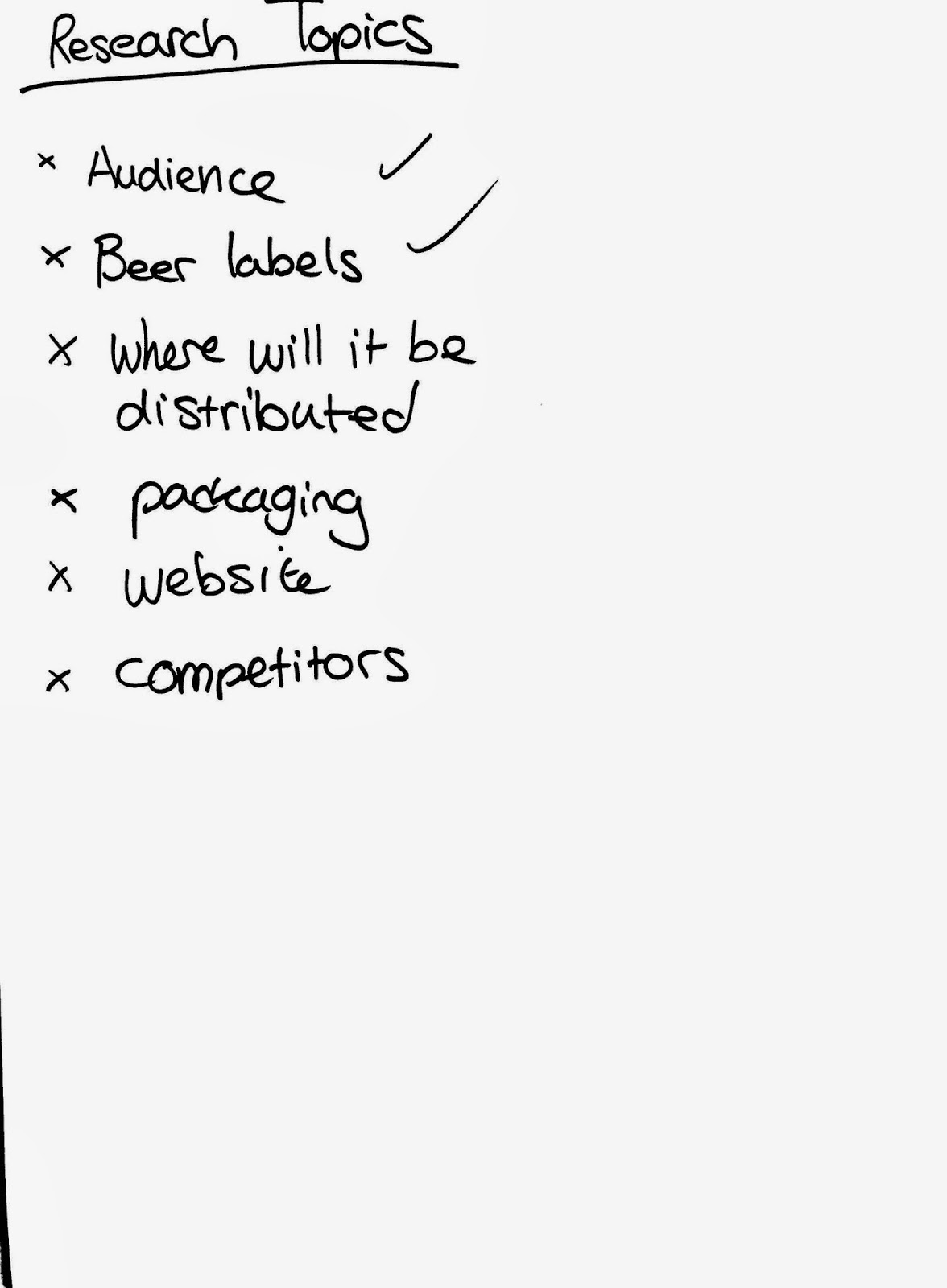
Round 1 - Audience:

hf I looked at the expanding market of ale drinkers and foudn some interesting statistics:There are 1000 breweries in the UKAverage pub stocks 1-2 permanent ales and rotates 3-4 (A potential market for Open Garage)53% of adults have tried real ale50% of pub-goers agree that good cask ale is an important reason for visiting a pubThere are now more female beer enthusiasts as it combines 3 trends:Natural IngredientsBritish Industry More taste variety than lager99% of kegs are aluminiumExporting abroad is a good market for British beers"Thirst for discovery and experience they can introduce their friends to""People are fed up of walking into pubs and seeing stuff they can buy in supermarkets for a premium price. They want something unique."


Beer Labels:
I found that I was drawn to the more experimental bottle designs - in particular those that used one colour on the brown of the bottle or which used alternatives to the traditional label such as a patch or direct illustration.


Packaging:


Brewery Websites:
Most of the brewery websites we looked at were extremely 90s and definitely miles behind current web design expectations. These were some that caught my eye for being above the crowd:

The kernel has an unusually clean aesthetic for a brewery website. This reflects the visual simplicity of the label. However, it is very text heavy and non-responsive.

Partizan brewery in London make great use of their tumblr page to promote the beer through artwork.

Camden Hells was one of the most modern and fresh-looking sites I came across, I love the illustrationf of each of the drinks and the smooth dynamic UI which is provided throughout

Brew by numbers have a very simple website, but the clean design makes it somewhat unique in the world of beer.
Experimental Websites:
We felt it was important to look outside of beer and into great web design in the wider food and drinks markets. We found exceptional examples of strong image-based design combined with cutting-edge HTML5 animation which really made the content pop and engaged the user:

Great use of colour and stripped-back flat graphic animations lead the user through a fun explanation.

This site uses an incerdible visual scrolling effect which mimics slow-mo cameras.

This Japanese fruit drink website used two characters to represent the range of drinks and this is something we found to be really fun and inviting.

This farming website had striking flat graphics and a long parallax single-page site to tell a story. We would look to incorporate the same bright and colourful approach to presenting the brewing process.

This unusual mcdonals site gives a grid of 100 animations to support the 100 moments campaign.
No comments:
Post a Comment