
While Andy worked on building the set of stylised characters, I worked on designing and developing a custom pixel typeface to use throughout the game branding, menus and dialogue. It can be challenging to produce legible typeforms using just the pixel grid, so we looked at both modern 'retro' fonts used in indie games as well as the original attempts that inspired them.
Research

The pokemon typeface is extremely well considered and manages to maximise legibility over style. It has a thin frame and a very square appearance. The glyphs are monospaced to ensure they always fit perfectly in the pixel grid. I think it particularly well implemented to the extent that you don't notice the type at all.
Here are some indie games that we have identified for their interesting use of typography in this style:
Bit Trip Beat/Runner
The bit trip games use a really chunky, low res custom pixel font. It is used repeatedly and often in a two-tone shadow style which is a simple way of creating depth in pixel art. This typeface is part of the game's overall aesthetic and really complements the style of the visuals well.


Jamestown
In contrast, Jamestown has tried in its display type to stylise too much and in too much detail as to look ugly. The body typeface is used consistently and brings a twist to traditional pixel fonts by introducing an off-centre slant is some of the letterforms. Again, this contributes heavily to the character of the game.

Fez:
Fez uses a more traditional-style thin typeface. It is a clean aesthetic that suits the detail of the gameworld and characters. It does little to communicate the character of the game otherwise though. I think that in our design, we need to tread the line carefully between character and clarity.

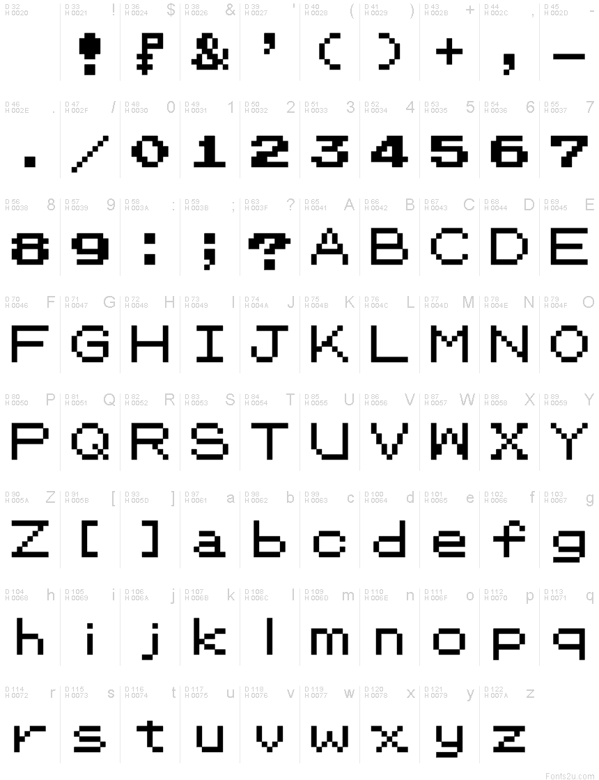
Designing the pixel typeface
This was an interesting and new way of working for me, as I had to work within the confines of the 7 x 5 pixel character grid to keep everything consistent, and this meant that tiny changes could have huge effects on tone and legibility. I created a set of letters, characters and numbers that would cover most use cases within the game. I also made an adaptive dialogue box inspired by game-boy era interface graphics, including the specs glasses as corner details and a simple white highlight for the surround.

Translating my initial sketches into digital squares gave me the freedom to make quick changes and check for legibility at different scales. Both me and Andy are working using a sized pixel grid to ensure that our designs can be combined as we move forward.

After a few rounds of refinement I favoured the letters that had one offset pixel such as:

Carrying this look through to the other letters, I was able to design a stylistic set of fixed-height letters, numbers and common glyphs that could fit into our game grid for dialogue, menus and instructions.


By creating the base characters first, I was able to create a lot of the character of the typeface that I could expand to other letterforms.

R was similar to a P but had to use a very simple 2 pixel diagonal for the tail to stay consistent. I felt that this gave it a bit of charm which should feed into the full alphabet.

Characters like U,V and W share very similar compositions.

I found Z to be a particularly challenging character, as the diagonal is hard to replicate in pixels within the format. Using charcteristics taken from N, I was able to develop a solution.

In the pixel fonts I had researched, additional characters were important and actually made a lot of difference to the feel of the character set.

Taking inspiration from the pokemon dialogue menus which use pokeballs in their corners, I designed a flexible dialogue box format which used glasses in the corners to contextualise my type.

Dialogue boxes in the original pokemon games
My solution for the specs dialogue boxes:


Final alphabet and dialogue box surround.
I also wanted to get an idea of how this would carry over to the UI of the game, so produced an early version of the controls menu

No comments:
Post a Comment