Sunday 30 March 2014

North Bar Leeds Mencap // Design and feedback

This project was a collaboration between me, Andy, Duke Studios and North Bar to enter the Leeds Mencap Apprentice challenge - spending only £50 and raising as much money as possible from that for the charity. Duke had developed the idea of selling specially designed, laser cut beer mats/coaters in the six North Bars in Leeds, for which drinkers could get for 50p when ordering.

Here is a statement of our shared aims for this project:

"The Leeds Mencap Apprentice Challenge is about bringing businesses and community groups together to support local people with learning disabilities, along with their families and carers.

Together Duke Studios, North Bar & Hungry Sandwich Club are aiming to raise £1300 for Leeds Mencap by selling collectable coasters in each of the six North Bars across Leeds."

For this, we needed a format that would encourage people to buy the whole set of 4 mats and have them relate together by using a consistent theme. The mats had to be laser cut, and so this placed restrictions on the way in which we could design.


After discussing some ideas, we decided to move forward with the idea of using half characters whose top and bottom halves would line up when all 4 mats were collected. We particularly liked the idea that people could mix different characters to create unintended combinations, and that this could encourage conversation and fun in the bar environment. We calculated that 8 characters, split into 16 halves, would be needed to achieve this effect. 


We drew some quick sketches and came up with the type of characters we would want to include. From here, we developed an illustration that would be really stripped back to reduce the time spent on the laser cutter. This reduced, single line approach proved to be a unfamiliar but rewarding way of working for us, forcing us to try and strip back any unnecessary details while still giving each of the figures character and unique details. 


Andy established the format we would be working to for the characters while I laid out a template for the beer mat according the specifications of the brief and laid out the type we would be using. 


Using the same proportions, I created old man and hipster characters to join the set and began to make adjustments to the shoes of similar characters to create more variation within the set. While Andy completed the full set of characters, I started to place them into the layout. We had to draw a diagram to make sure that all of the heads and legs were separated onto different mats and that everything would connect as we wanted it to. 


This was our first draft of the mat design. 

We found that a lot of the line work on the characters had to be cleaned up to avoid duplication delaying the laser cutter. Andy made sure that all of the shapes were fixed before I placed them into the layout. 


Here was our initial set of characters. 


Feedback:

There was some initial concern over the way we had portrayed some of the characters, and we were asked to alter some of them to avoid causing any possible offence due to the mats being in support of a mental health charity. We toned down a lot of the childlike qualities, especially in the character with the donut. We also used a single stroke for the eyes instead of double to make the characters more friendly. We were also asked to make the characters larger in the composition.

so again, andy focussed on altering the characters and making the alterations as we had been asked. I increased the size of the characters and distributed the text differently. Here were the new characters and composition


Feedback:

Seeing these changes, they really liked the new characters and had the idea of cutting notches in the mats so that there would be no gap between a character's top and bottom half. The idea was that this would encourage people to connect them together. To better do this, we were asked to remove the inner ring entirely and push the characters right to the edges. The text could then be slotted between them on the 4 corners. In an initial test cut, we found that the outlined text did not reproduce well on the laser cutter and so we had to use a single line replacement font which would produce a finer cut. 


This was the final design they were happy with, and after some initial test cuts we were given the go-ahead. 


Thursday 27 March 2014

Jaypee // Artwork

These were the characters we handed over to Jaypee to form part of the mural. He asked for all of our separate pieces to be put into a dropbox so he could manipulate them to fit the overall aesthetic. Over the next few days, Jonny worked out a colour scheme, shifting our designs from two colours to one:


We decided that white vinyl would work best with the rest of the room and that we should distribute the characters evenly in a diagonal pattern. 


Final artwork for cutting.


Open Garage // Leeds College of Music collaboration

As part of an inter-college collaboration, we were paired with producer and music sync writer Rebecca Saif who was looking for animators to compose music for. This was really helpful for us as we had just finished our concept promotional animation for the Open Garage project. We sent over the short clip and she was really happy with the visuals and began to produce an accompanying soundtrack.


Clip from the animation


Clip from the animation

Rebecca sent us back a draft really fast. We were really impressed with the quality of what she had produced in such a short space of time, and she had done a fantastic job of capturing the playfulness of the animation style. However, we had some concerns about the more childish elements in her approach as the video promoted an alcoholic drink. We sent back some feedback about this first draft and Rebecca was understanding and responded by making the tone more adult while adding ambient bar sounds in the background to better suit the subject matter. We were both happy with the final outcome and the process of the collaboration, and would definitely work with Rebecca gain in the future. 


Tuesday 25 March 2014

Jaypee // Pitch Boards

We were keen to pitch for the window space of the room as we felt that we needed to build this area of our portfolio with more window vinyl projects. For our pitch, we brainstormed some ideas of what could be done with space. As part of our pitch, we included some references of the type of approach we would take with our illustration:

We liked the simple shapes and variation in this Nous Vous window display. Matt vinyl looks great against the shiny glass and they have done a lot with only one colour.


Dan Woodger is very good at creating personifications of inanimate objects and creating large scenes of interacting characters. The theme we are proposing is 'tools of the trade', so we would be looking to bring everyday tools of the deisgner to life in the same kind of way.


In terms of illustration style for this, we want to keep the construction very simple and geometric. This is something Hey Studio are exceptionally good at.


After listing some ideas for characters, Andy drafted up some quick sketches to include in our pitch.


Which we included in mock-up form within our boards.


Here were the pitch boards we submitted. We were chosen along with Natalie, Tanni, Hannah and Josh to complete the mural and we were given the window space to apply our vinyl display. We had chosen the colours orange and purple to match the new seats in the corridor.

Friday 21 March 2014

Jaypee // Briefing

Today Jaypee came in to give a presentation to the class and talk about his life and progression after college:

This is an example of the work that he was producing whilst on the course:


He has progressed to focus on developing his illustration style and now works primarily as a freelance illustrator in and around Leeds. Here are some examples of his current work:


He then presented his live brief and invited our year to pitch for the chance to transform the briefing room with a collaborative mural. I chose to work with Andy on this project as we needed more examples of window vinyl to add to our studio portfolio. We pitched exclusively for the window areas and not the walls. Here are our initial proposal boards:


Thursday 20 March 2014

North Bar Leeds Mencap // Brief

Apprentice Challenge Brief (Collaboration with Andy Foster)

Background:
This is the first year of Leeds Mencap Apprentice challenge, in which teams are given £50 and need to convert this amount into as much money as possible for the charity. We were asked to work with Duke Studios and North Bar as a team to design, produce and sell a one-off run of collectable coasters to reach an aim of raising £1300 for the charity.

Brief:
Design a set of 4 collectable beer mats to be sold across the North Bar chain of pubs in Leeds. These will be laser cut by Duke Studios onto kraft board and distributed in a volume of 2700. The design needs to be simple as it will be produced in high volume and should be quick to laser cut, minimising the detail as much as possible. The design should not reference beer as may be sold outside of the bar environment. A consistent theme should run across the set to encourage people to buy all 4.

Audience:
North Bar attracts a lot of craft beer drinkers as it stocks a huge number of microbreweries and independently brewed drinks. Drinks tend to be higher priced than other venues and so visitors are likely to have disposable income to spend on the beer mats.

Tone:
Eye Catching Collectable Simple

Monday 17 March 2014

One Hundred Bears Evaluation

Nobrow are one my favourite publishers, and I had the best time on my two week placement. I was keen to impress with this live brief and was given a choice of which new release to produce a trailer for. I chose 100 bears because of the simple and striking illustration style that would made it easy to animate. This was one of the most complex animations I have produced, and used a completely new animating style to other projects, actively trying to create an aesthetic that was lo-fi and didn’t look like a smooth After Effects animation. This required me to learn a huge number of new techniques and experiment with different methods to find a solution that was appropriate to the brief and target audience, was well as being true to the original book. 

This project improved my animation skills significantly, and I hope to build on these in future projects.  I ended up using so many elements in the project that I had to learn to obsess over the tiny details and timings while keeping everything organised else the project would get out of control. This project planning is something I have gotten much better at throughout the year and I now consider it a strength that is starting to see this pay off within my college briefs. I was really proud of how this animation turned out as I was able to take the provided static artwork and bring it to life through careful planning, design, music production and animation. This produced a result that is really different to other motion graphics I have made on the course, and I would love to work in this way again in the future. 

Sunday 16 March 2014

Open Garage // Studio Photoshoot

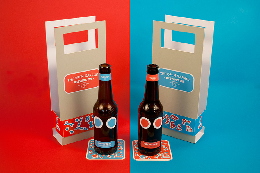
While the bar pictures did a great job of presenting our bottle designs, it would feel forced and unnatural to use this setting to photograph packaging. We set up a studio shoot with lights and coloured card backdrops to capture the remaining elements. We took our inspiration for the red/blue divide from the way studio like TwoTimesElliott photograph work e.g.

]

Here were the photographs we chose to use:


One Hundred Bears // Revised animation


This is the completed animation that I sent back to Nobrow. I was much happier with this version, as it fixed a lot of the sloppy mistakes that I have overlooked when I first produced it. With fresh eyes I was able to notice when pages were off-centre and fix the camera to make the book central in the frame. I could correct the mismatched page sizes by manually tweaking them and tightening up the timings. By tightening up the animation, it brought everything together and made the whole project look much more impressive and effective as a promotional trailer.

I was also asked to produce GIFs that could be shared on tumblr to promote the book. The illustrations and colours in the book lend themselves really well to these kind of jumpy looping animations. In photoshop, I was able to take some of the elements from the animation and isolate them as standalone squares for tumblr:


Deserts 


Counting


Present

Thursday 13 March 2014

Nobrow 100 Bears // Promo Animation + Feedback


This was the initial animation that I sent back to Nobrow. They were really pleased with it but asked for a few changes to be made:

- The book is slightly wonky, is there any chance you could straighten up the pages.
- One of the pages is an old file, could this be replaced with the new one, attached.
- Would it be possible to put together a GIF with the animation to have one to use for social media.
- If you wanted you could link the video back and credit yourself at the end of the animation "video by… or animation by … "

I also spotted some things that I wanted to improve before I sent back the final draft:
- Some of the pages were slightly a slightly different size to their adjacent page.
- The music and animation stops abruptly, I'd like to fade out both. 
- Re-centre the pages on the spine, as they drift further off as the animation progresses. 


Tuesday 11 March 2014

One Hundred Bears // Intro and details

With the separate compositions in place, I had to produce an intro to the video which would show the cover of the book. As I wanted to begin the animation with an open book, I couldn't show the cover as closed so instead I had to use the artwork as a full-screen graphic. I made a intro using the elements of the flying eye logo, but decided against using this in the animation as its didn't really fit the tone of the rest of the work I had done.


Instead, I decided to reference the publisher as a page at the end of the book and focus on representing the title at the front. Looking at the cover illustration, there was little I could do to animate it without having the separate design files. Instead I wanted to give a friendly and subtle introduction by rotating the top bear's arm slightly to make him wave in time to the music:

A

B

I made this intro just long enough to make a change in the music line up to the clock striking 11. This creates a much better paced composition. 

While the animation was structurally in place at this stage, the book just wasn't convincing enough. I needed to work on building a level of detail that would make the pages seem more like paper and the folds less wooden in their animation. I used a number of techniques to do this:

Page Noise:
I created a noise texture in photoshop to make the pages look more like the printed page and remove the clean digital look that takes away from the aesthetic slightly. I could apply this to every page and lower the opacity to make the effect as subtle as possible. 


Here was the noise texture used. 


before


after

Shadow:
The pages currently looked too flat, when a real page would bend towards the spine. To simulate this, I made a simple gradient at the edge of the page. As the page went to turn, I moved this gradient in the composition further in which better supports the illusion that the bend in the page is turning and makes the animation look much more realistic. When timed with the 3D rotation this effect worked surprising well. 


In context:


CC Bender:

Finally, I didn't like how the turning page looed like a board and had no movement it in. This was a challenge to imitate in 3D, but I found an effect called CC Bender that warped the edges of the pages as if they had been bent. By applying this to the right amount at the right times, I was bale to subtly warp the pages in 2D to create an effect that mimicked the movement of a page in 3D. 


Before

After

Coloured Backgrounds:
As the original illutrations used such strong and striking colours, I went through the animation and made the background colour switch periodically to become a prominent colour from the composition. By cycling through these, it should help to promote the vibrancy of the book. This effect was particularly good at enhancing the clock tower scene, where the music and colour change are timed to just as the clock strikes and gives the action more emphasis in the composition. 


Combined, these effects made the animation more realistic and gave some style to the simple page turn which should all help to bring the characters to life. 


Open Garage // Photoshoot at The Social

We decided that the best way to present our design would be to do the majority of the photography in a natural bar setting. After reprinting the back-label on an opaque stock, we set about finding a venue. We chose the social as it is a bright, modern space which would give context to our work. I was really pleased with the quality of the photographs, loads of natural light meant that we had to do very little post editing to get everything looking its best.


The owner gave us some feedback on the product, saying that he liked the idea and that it could have the potential to be picked up by a major brewery as a special edition or limited run. He did say however that it wouldn't be viable for a permanent or large-run of drinks, as the cost of producing it with conventional labelling methods would be prohibitively high.