Another project that I wanted to ensure was photographed at its best was the Uberguine. I was really pleased with the format of the newspaper and particarly with the addition of the faux die-cut wrap-around. Using a mango stock and strong lighting, we were able to bring out the pink highlight well and capture the detail of the print for portfolio.
Wednesday, 4 December 2013
Tuesday, 3 December 2013
TBM Flag // Rearch into Build
We were told to look at the work of Build in London for some inspiration in creating a stronger data-driven flag:
The arrangement in all of these examples is very industrial and complicated, but with simple building blocks making up every design. There is a strong sense of order and organisation running through all of their work and the colour is always used sparingly. This kind of aesthetic could definitely suit a radical overhaul of the union flag.
Through our experiments we found that converting data into shapes for this project was producing quite raw and industrial graphics anyway and that with better organisation and presentation we could find an innovative solution to the brief.
Specs // Photo Studio
We had to make sure that the project was presented in a professional way. We were happy with the standard of polish on the animatio and wanted to make sure that we gave the same attention to the printed outcomes we had produced. The new digital printers are able to really capture the detail and colour in thus project that we wouldn't have been able to achieve last year. Photographing well was essential to capturing this. The clean, white background was chosen as an effect as it was reminiscent of the aesthetic of early xbox 360 ads. This was also enhanced with the use of a prop controller.
Monday, 2 December 2013
Hungry Sandwich Club // Studio Analysis
We aim to pick apart what studios that we have an affinity with. This will give a strong base to establish our own brand and business strategy:
1. Brosmind (Barcelona)
Illustrators and image based designers. They work over a huge range of media and are constantly looking for new opportunities to apply their illustrative style in unfamiliar territory. This always leaves them outside their comfort zone.
We like that they present themselves as characters. Clients are buying into their personalities and individualism, which is closely tied to the brand. This is an unusual approach for a studio, and definitely something we would be interested in exploring.
Description:
'Fresh and optimistic'
'combining fantasy and humour'
In ten years, they aim to exclusively work on personal projects.
They talk at design events and are really strong at presenting, combining lo-fi and surrealist aesthetics which contrasts their slick and polished work well.
2. Nous Vous (London)
Description:
"Nous Vous is a small and close-knit collective
made up of three practitioners collaborating on
graphic design work, illustration, exhibitions and
other self-initiated projects.
Image-making is central to our work.
We've developed a bold, cohesive, graphic visual
language suited to a range of applications in
print, digital and moving image.
We apply our collaborative approach to a wide
range of projects, working towards the most
appropriate and exciting outcome for each brief
and exploring new creative processes.
We're very much open to working with other
design studios, artists, institutions and individuals"
Nous Vous work on a lot of community projects, and have received council funding to run workshops and build installations. While not something we would be interested in, we appreciate that this has been a great avenue of exposure for them. We want to find other ways of publicising our services.
Like Brosmind, they are able to apply image-based design to a range of different projects, working in different media, scales and budgets but keeping their aesthetic in tact. It is worth noting that each of the members promotes their individual style and act as a collective. We would prefer to produce work as a company not as individuals.
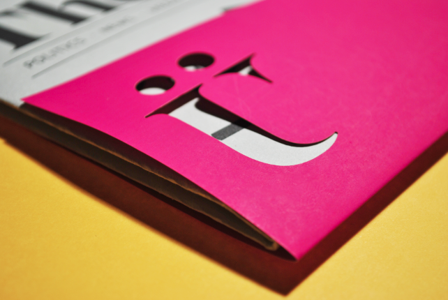
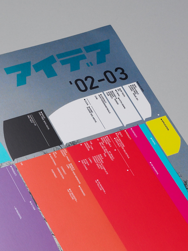
Hey Studio (Barcelona)
'Hey
We are a design studio based in Barcelona.
We mostly work in brand identity, illustration and editorial design.
We always wanted to have our own style, and we believe we have achieved it.
Geometry, color, direct typography. Let’s say purity. When we look back
over our work we feel it is consistent, but we usually prefer to look forward.
Our personal projects are almost as important as the commercial ones.
They let us explore, innovate, travel to other dimensions and meet nice people.
We are small. We like it that way because it lets us stay close to our clients,
be flexible and take care of every single detail at every step of the process.
We’re sure you have read that before somewhere else, but we mean it.
Work with us and you’ll see.'
We really like this personal description. Unlike NousVous you feel like it is engaging with you personally. It feels genuine and you get the impression that they believe what they are saying.
We like working to the same visual principles as Hey, often stripping things back to simple shapes, strong colours and communicating clearly through flat graphics. Hey are internationally successful and have achieved so much for just 4 people. This is inspiring for us, as they have achieved their aims while remaining a small studio.
We found a great interview with YCN magazine, in which they say:
What for you would be a dream project?
Regardless of the client, it would be a project that lets us grow and explore new ideas and concepts.
This is a great answer, and one that we totally agree with.
Who is Hey Studio ? Tell us more about you.
Hey was founded in 2007. We do graphic design and illustration projects. I started Heywith my partner Tilman Solé and then Ricardo Jorge joined the studio one year later. The first years we worked for friends and personal projects. Then after two years we started to do more real projects for cultural clients, publishing houses and for an important NGO (Non-Governmental Organisations).
What’s your interest about illustration and graphic design ? When did you start ?
We like graphic design & Illustration and we like to mix it in almost all projects. Illustration is a powerful tool to communicate in graphic design. Two years after founded Hey we started to think about doing illustration. We sent our little illustration portfolio to Monocleand they trusted us. Monocle is a very important magazine it’s like an open window to potential clients
Leeds Locals:
- Passport -
Passport is a young and independent design bureau founded by Jonathan Finch & Rosalind Stoughton, based in Leeds.
Certain destinations and international design culture have informed and influenced our practice which is centred around print-based design for branding, identity and publications.
Please feel free to get in touch to find out more about what services we offer and how we could benefit from working together.
Our services include:
Branding
Creative Direction
Editorial Design
Identity
Packaging
Print Design
Promotion
Publications
Typography
Web Design
Passport use a number of techniques to position themselves as high-class designers with a clean, posh aesthetic. Firstly, the service they provide to clients is very clear from the website and there are multiple high-quality examples of full brand treatment. Their own branding very much reflects the type of work they attract. The website is just as clean, with a high attention to detail that presents them in the most professional light possible.
For us, Passport are not competitors as they have a very different visual style and interests to us. We will hope to attract a different type of client. In order to embed ourselves successfully in the Leeds creative scene, we need to differentiate ourselves from other Leeds-based design studios. We think that we could have a complimentary skillset to these types of studios,
Lord Whitney:
They focus on set design, art direction and prop making. While not graphic designers, they have established themselves as the go-to people for dressing spaces in Leeds. They could be an ally in the future as they are able to bring designs into the physical world, which could be great for events, exhibitions etc. For Jack Hudson, they were able to create amazing photographic adaptations of his style. This kind of aesthetic would definitely be something that interests us.
Prints of Thieves:
Description:
Prints of Thieves is a custom screen print service based in Leeds, UK. We specialise in gig posters and art prints but can also print a range of products including business cards, wedding stationary and tote bags. Our prints are produced individually by hand using environmentally friendly, water-based inks.
The Prints of Thieves workshop was set up in October 2012 by Tommy Davidson. Tommy is an illustrator and musician with a passion for the screen print process. The aim of the workshop is to offer a quality service to others at an affordable rate.
They could be a valuable contact for us in terms of printing work in the future, when college facilities are no longer available to us.
Sunday, 1 December 2013
TBM Flag - Crit
These were the boards we presented in the crit to TBM.
The crit took the form of a direct presentation to Ben and Martin from The Beautiful Meme. We talked through our boards and they were both drawn to one of our early attempts to use data to inform the construction of the flag. They told us that this was a very different approach They much preferred this to the concept we had presented as our final idea. We agreed that our final idea was a bit rushed and ended up lacking as a result. Their feedback was that our final flag didn't feel British any more, which was true. They suggested that we go back to our data flag idea and try and be slightly looser with our use of the data. They loved the idea of making shapes which were proportioned to the landmass of each country and said that we should look at the work of Build in London for some examples of this type of work. By being less exact with our proportions, they thought that we would be able to make something more aesthetic but still informed.
I found this crit really helpful. We have both found this to be a difficult brief, especially given the short deadline and other constraints on time at this point in the year. They were able to give us some direction and help us to move the brief forward when we were stuck on it. Our next step will be to go back to the drawing board and try and implement these changes.
Elmwood - Brand the Boring
During the briefing, each of us was allocated a 'boring' job which we should try and brand in a way that made it stand out from the crowd. I was really happy with my selection - Energy Supply Company
It became clear that while this service could not be provided as cheaply as traditional suppliers, there were plenty of ways to differentiate the two offerings and truly provide a better service to engaged consumers who are environmentally aware and want to know where their energy comes from, not just how much it will cost e.g:
Elmwood's advice for this was to think of a concept to run with and develop it quickly. The short time-frame of the brief in an already busy time-period also encouraged this way of working. Some initial words came to mind:
Power
Activity
Drive
Capacity
Function
Grid
Field
Charge
Current
Plug
I looked at some news articles and found that there is a large amount of dissatisfaction with energy supplies at the moment and there is definitely opportunity to differentiate from the crowd. Some quotes from the article say people "have a deep distrust of anything the energy companies say or do".
"customers are not convinced that the price increases they see are either fair or justified."
I came to the conclusion that a new energy supplier would need to present themselves as transparent and fair to a much larger extent than established players. With this in mind I thought of some initial taglines:
Power to the people
Putting you in charge
Bright Spark
I settled on the concept of a green energy supplier called Earth Wire.
Looking into the concept I found 3 main providers of sustainable energy plans:
1. Good Energy
Really simple, uncluttered website that has a friendly tone and reassures potential customers that the process of switching is safe and easy.
Looking into the concept I found 3 main providers of sustainable energy plans:
1. Good Energy
Really simple, uncluttered website that has a friendly tone and reassures potential customers that the process of switching is safe and easy.
2. Ecotricity
Claims to be the UK's oldest green energy supplier. Quite consumer friendly in its appearance. All of its customers bill profit goes directly into investing into developing more sustainable sources. Still makes the process of switching to green energy seem daunting.
3. Green Energy
Does a really good job of educating the consumer, providing demonstrations of each of the different energy sources. Unfortunately it is a really forgettable brand and this does little to reassure the consumer of the quality of the service.
It became clear that while this service could not be provided as cheaply as traditional suppliers, there were plenty of ways to differentiate the two offerings and truly provide a better service to engaged consumers who are environmentally aware and want to know where their energy comes from, not just how much it will cost e.g:
I thought about what a truly responsible energy supplier would be able to provide for consumers and looked to the mobile phone market for an example. GiffGaff provide a fantastically different service to mainstream providers by letting consumers change their price plans each month instead of tying them to contracts that might not suit them further down the line. There are many complaints of consumers locked into unsuitable energy contracts and a solution like this has yet to emerge.
Price plans (called goody bags)
I was keen on creating a clever logo concept for this brief and started looking at the negative space work of Noma Bar:
Using the the idea of hidden imagery, I wanted to combine a house with a plug. When I digitised this, it occurred to me that the windows and door on a simplified house make the shape of a UK plug socket anyway.
I wanted to really push the visuals aspect of using a plug socket so made a surround for the logo to represent the plug face and position the socket in the correct place on the left hand side. I also think this frames the two elements in a much more effective way and still keeps the subtlety of negative space.
This is the logo I settled on to present at the crit on Tuesday.
Subscribe to:
Posts (Atom)